


 400-801-0899


 当前位置:
当前位置:

 常见问题
常见问题
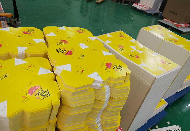
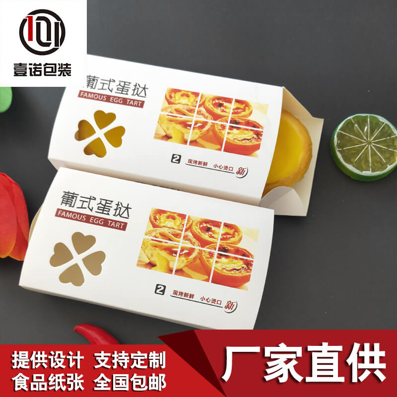
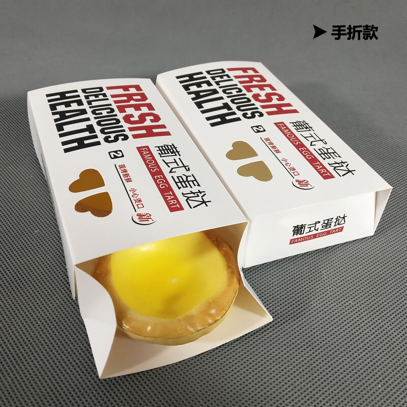
如何设计披萨盒纸盒包装的色彩?
来源:www.sdynbz.com 发布时间:2021-09-08 浏览次数:122
纸盒包装在很多时候是一种产品的外包装,十分被人看重。所以其被要求美观大方,满足人们的审美观。这就要靠色彩设计和调配了,依附于图形、文字的内涵也要表现出来。
Carton packaging is often the outer packaging of a product, which is very valued by people. Therefore, it is required to be beautiful and generous to meet people's aesthetic outlook. This depends on color design and deployment, and the connotation attached to graphics and words should also be expressed.
重要的,就是纸盒包装的色调了。色调是画面上色彩配置所具有的总倾向、总情调,是一组色彩的主色,并在全画面中占优势印刷技术。包装要求在远距离的货架上从一瞬间的视觉上突出出来,传达商品信息,这就要求整体感强的色调来配合印刷市场。
The important thing is the tone of carton packaging. Tone is the general tendency and general mood of color configuration on the picture. It is the main color of a group of colors and occupies an advantage in the whole picture. Packaging is required to stand out from a moment's vision on a long-distance shelf to convey commodity information, which requires a strong overall sense of color to cooperate with the printing market.

因此,包装色彩设计的关键,就是色调设计设备耗材。色调设计要求与产品的主要功能相统一。色调设计要求与时代、与不同地区、不同民族对色彩的喜忌相统一,要能适应这种变化,顺应时代潮流。
Therefore, the key of packaging color design is color design equipment consumables. The tone design requirements shall be unified with the main functions of the product. The requirements of tone design should be consistent with the times, different regions and different nationalities' likes and dislikes of color. It should be able to adapt to this change and the trend of the times.
再者,就是色彩的相互对比和映衬。两个相互对顶的色彩叫对比色,其色相明度差异大,给人留下鲜明、强烈的对比感觉印刷工具。色彩只有通过对比,才能正确表达形象印刷联盟。
Moreover, it is the mutual contrast and contrast of colors. Two mutually opposite colors are called contrast colors. Their hue and lightness differ greatly, leaving a distinct and strong sense of contrast. Only through contrast can color correctly express the image of the printing alliance.
有对比,也就有调和。两个相近的色彩叫调和色印刷工具。色彩调和给人以含蓄、丰富、高雅、愉悦、舒服的感觉。
There is contrast, there is harmony. Two similar colors are called harmonic printing tools. Color harmony gives people a subtle, rich, elegant, pleasant and comfortable feeling.
色彩方面还有一点很重要的就是节奏。人们常说音乐有节奏,为何色彩也存在节奏?节奏是构成画面形式感的重要因素,体现在画面上则有许多变化,如强弱、明暗、刚柔、虚实等,这些矛盾双方的交替变幻,并不是简单的重复,而是多种形式的节律运动,它既有重复、又有发展,各个方面互相制约、互相推进,体现了自然的和谐印刷市场。
Another important thing about color is rhythm. People often say that music has rhythm. Why does color also have rhythm? Rhythm is an important factor constituting the sense of form of the picture. There are many changes reflected in the picture, such as strength, light and shade, hardness and softness, virtual and real, etc. the alternating changes of these contradictions are not simple repetition, but various forms of rhythmic movement. It has both repetition and development. All aspects restrict and promote each other, reflecting the natural harmonious printing market.
包装色彩设计的基本要求是要处理好变化与统一的关系,在统一中求变化,在变化中求统一,这就是所谓的色彩节奏。
The basic requirement of packaging color design is to deal with the relationship between change and unity, seek change in unity and unity in change, which is the so-called color rhythm.
披萨盒纸盒包装的色彩设计十分讲究,并不是简单的联想就能一下子想出好点子的,需要经过反复的斟酌和对色彩方面成熟的把握。要把包装设计得满意,绝非是一朝一夕的事情。
The color design of pizza box and carton packaging is very particular. It is not a simple association that can come up with good ideas at once. It needs repeated consideration and mature grasp of color. To be satisfied with the packaging design is by no means an overnight thing.


相关新闻
- 礼品盒防潮防霉预防与解决2021-05-29
- 常见的包装盒的展示2021-05-29
- 包装设计“形式”的展现文化2021-05-29
- 高端包装礼盒近年来的发展趋势2021-05-29
- 印刷样品的检查与处理2021-05-29
- 外卖打包袋厂家教你如何选择适合自己的外卖包装? 2021-06-22
- 阴雨天如何运输一次性小吃盒?2021-06-25
- 塑料餐具表面处理的方法!2021-07-02


 鲁公网安备 37010502001692号