

 400-801-0899


 当前位置:
当前位置:

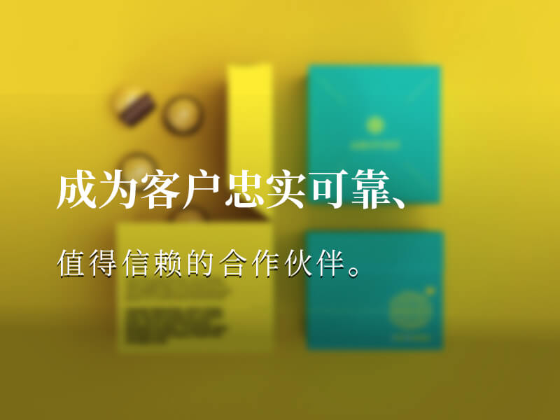
 公司动态
公司动态
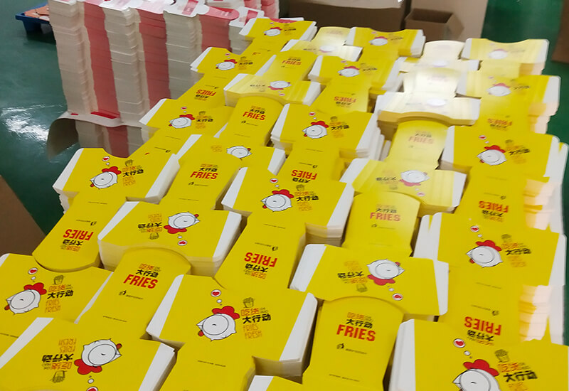
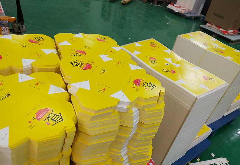
食品包装盒:海报设计字体都有哪些技巧?
来源:www.sdynbz.com 发布时间:2022-03-14 浏览次数:122
海报是最常见的宣传广告方式之一,那么问题就来了,那么怎么样才能设计出好的海报设计,具有更好的宣传产品或者企业文化呢?在海报设计中,字体设计也是设计好的海报重要的一环,字体设计有哪些技巧呢?
Poster is one of the most common ways of publicity and advertising, so the problem comes. So how can we design a good poster design and have a better publicity product or corporate culture? In poster design, font design is also an important part of a well-designed poster. What are the skills of font design?
1. 字体的风格1. Font style
每一个字体都有它本身的风格特色。不用我说人们都是比较喜欢带有特色的东西,例如去一个不经常去的饭店,又不知道什么菜系好,人气爆棚菜什么的,那么我们就会问服务员你们这里的特色菜有哪些,给我点一份等等诸如之类的。言归正传,要想被人群喜欢的字体呢?先了解目标人群,再选择一类字体,是你目前人群所期望的字体。
Each font has its own style characteristics. Needless to say, people prefer things with characteristics, such as going to a restaurant they don't often go to, and they don't know what kind of dishes are good and popular. Then we'll ask the waiter what are your specialties here, order me one, and so on. To get back to business, what about fonts that people like? First understand the target population, and then select a type of font, which is the font expected by your current population.
2. 避免使用默认字体2. Avoid using default fonts
如果你经常在语句或设计中使用默认字体呢?就说明你向世界宣言你还不知道还有其它存在的字体。换一个字体试试或许有不一样的火花碰撞。
What if you often use the default font in your statements or designs? It means you declare to the world that you don't know there are other fonts. Try another font. Maybe there's a different spark collision.
3. 避免使用被过度的字体3. Avoid using excessive fonts
一种字体很受欢迎,都在使用我们就称之为过度使用,或许会有点厌倦。这也是电脑拥有很多一样的字体所造成的。如果你找一个字体和文档风格相符合的,就安装一个新字体,或许新的字体会给人眼前一亮。
A font is very popular and is in use. We call it overuse, which may be a little tired. This is also caused by the fact that computers have many of the same fonts. If you find a font that matches the document style, install a new font. Maybe the new font will shine in front of people.
4. 使用两种字体4. Use two fonts
一种是标题、一种是文本内容使用。这样将会让你的文档看起来更清晰、更显的有章法、通俗易懂、有吸引力、简洁明了等。
One is the title and the other is the use of text content. This will make your document look clearer, more structured, easy to understand, attractive, concise and so on.
5. 字体大小5. Font size
标题是需要比文本大的字体,在文档在比较重要的文字也可以把字体调突出一点。
The title needs a larger font than the text, and the font can also be highlighted in the more important text of the document.
以上就是食品包装盒厂家介绍的关于海报字体的技巧,了解海报的字体的就可以轻松的设计出不同风格的字体海报了。
The above is the skills about poster fonts introduced by food packaging box manufacturers. If you understand the fonts of posters, you can easily design different styles of font posters.
上一篇:创意礼盒制作发展的潮流时代!
下一篇:水果礼品包装盒设计要点


相关新闻
- 礼盒的设计生产标准2021-05-29
- 纸质包装盒的使用为什么越来越广泛2021-05-29
- 色彩搭配如何使包装盒更吸引人2021-05-29
- 常见的包装盒材质有哪些2021-05-29
- 高端礼品包装盒设计需要提起aN确定的什么?2021-05-29
- 小吃盒批发讲解的一次性餐盒有哪些类型?2021-06-17
- 一次性纸餐盒如何区分好坏?2021-06-23
- 一次性塑料小吃盒安全吗?2021-06-28


 鲁公网安备 37010502001692号